

Blowing Rock
Logo, Slogan, Brand Guide, Billboard & Magazine Ad
The goal was to create a simple, modern, and timeless brand for the City of Blowing Rock that is versatile and easily recognized. Deliverables include a billboard and magazine ad campaign.
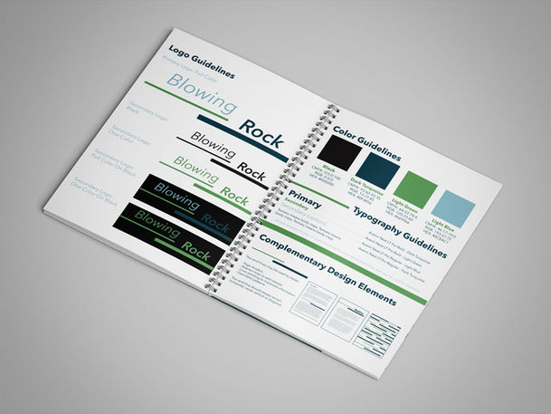
The simple straight lines in two different weights are inspired by lines they sometimes use on weather maps to represent wind and they can easily be used as a graphic element on materials without overwhelming the content. The italic text also conveys motion representing the wind, reflecting the legend of the rock formation the city was named after. The first line and text for Blowing are lighter weight and stop just before the heavier weight text of Rock with a bold line underneath. The different font and line weights are complementary. The color version uses earth tones of dark turquoise, light green, and light blue representative of the outdoor activities that are available in Blowing Rock. Blowing is the light blue keeping it light like the wind, the line under it is light green, Rock and the line under it are dark turquoise adding weight to the bold text. The logo is memorable, balanced, simple, modern, and timeless.
The slogan "Air moves differently here." is inspired by the legend and the phenomenon of air blowing up the Blowing Rock formation from the valley and representing the uniqueness of the city. It encourages people to take a breather, escape their everyday lives and visit Blowing Rock to relax and enjoy everything the city has to offer.
The Billboard Ad and Magazine Ad feature an image of The Blowing Rock Attraction with a beautiful view below and a couple sitting on the rock. The logo appears in full color with the slogan underneath. The headline reads Scenic Adventures Await and the magazine ad has additional copy that reads – Breeze into Blowing Rock for an adventure filled with leaves, legends, and leisure along the Blue Ridge Parkway.


